Project Description
The main goal of Ticketly is to connect all possible ways of Polish public transport and enable users to purchase tickets for them. It is a magnificent app that has been developed over the years. A complex infrastructure has been created connecting the app, website, ticket machines, bus checkouts and more.
ProblemPoor user ratings and feedback, not following the competitor's grown, old-fashioned look, weak system performance.
SolutionAdding the new functionalities based on the market, improving the registration process, changing the IA, refreshing the UI design
Process
Firstly, we needed to understand how the current system is working. We were surprised by how complicated the structure of tickets can be. We spend weeks getting to know how it works and what technological constraints we can meet. It helped us realize that the current system allows creating items without any limits. Our first thought was that we had to build the most flexible application possible.
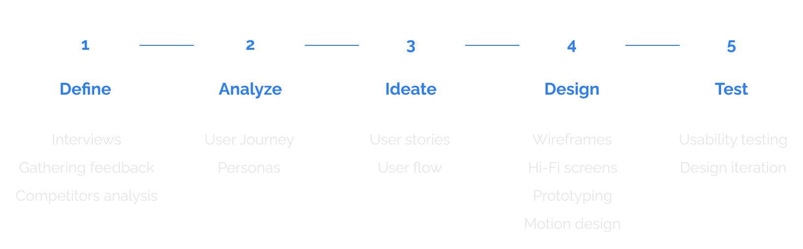
Define
We were trying to learn the most common issues users face when using the application. We decided to gather users feedback from the app stores reviews and the interviews. Furthermore, we can identify the main users' problems by considering their feedback.
Insights
Certain user behaviors are not observable during interviews, it is why we decided to check rough data collected over the years. According to them, we have been able to learn more about our users. Understanding the typical purchase decisions made by users would help us develop a more effective information architecture. Some of the most significant insights we can include are:
Gathering ideas
On the market, there are several similar solutions, but Ticketly has not been updated for years and lacks key functionalities. Analysis of competitors' solutions has provided us with ideas on which patterns we should use in our final product. In addition, by considering competitors' reviews from the Apple Store and Google Play, we were able to identify areas for improvement.
- Allow users to obtain tickets without registration - It was not possible because of the inclusion of season tickets and the requirements of certain operators. We have decided to offer two application options: Full and Mini.
- Add the current location of vehicles - Nothing is worse than waiting for our train or bus. Using a public API, we can track the real- time location of vehicles on a map.
- Simplify descriptions and names - Every discount name (eg. 37% - Cywilna niewidoma ofiara działań wojennych (całkowicie niezdolna do pracy) is a result of Polish law, and we cannot modify it. We decided to set new short names that users can see, but we will hide the full description under a button.
- Speed up the purchasing process - Our goal was to modify the system to reduce the number of steps required.
- Get more payment options - Except for credit cards and tPurse (an internal prepaid payment method), we wanted to launch Apple Pay and Google Pay
- Improve messages content from application - We have identified the most common technical issues with the purchase process. Our developers made the necessary optimizations. Moreover, we have modified and added clearer messages.
Design
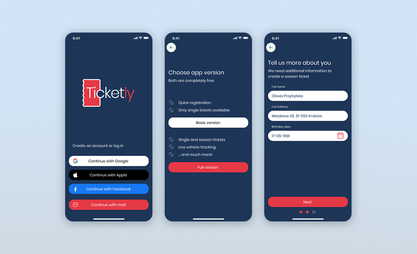
Welcome usersAs mentioned before, one of our goals was to reduce the number of steps for registration. Solutions that have been implemented
- Possibility to use multiple registration methods, such as using a Google, Facebook, or Apple account
- A choice between the Basic and Full app version
- Users are asked only for the necessary personal data (full name, email address, birthdate, and password) required for the monthly ticket (Full version)
- Short descriptions in bullet points to better understand the difference
- A progress bar at the bottom enhances the visibility of the registration process.
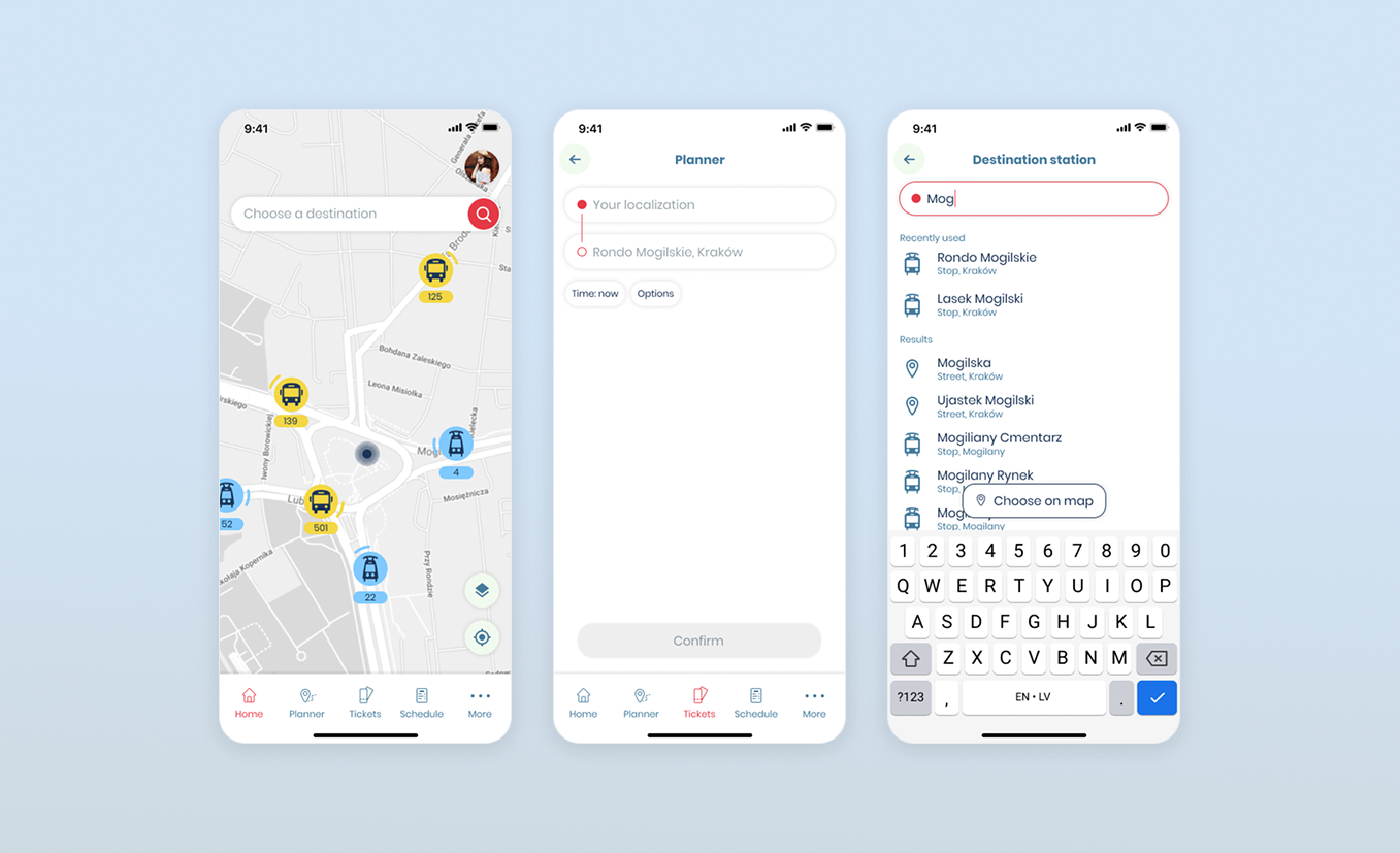
How can I get to...
Across interviews with users and reviews left on the app stores, we found that people wanted more efficient navigation in the app. Due to the implementation of the OpenStreetMap API, we were able to introduce planner functionality.
The client had one of the biggest requirements: to enhance people's mobility, even in small villages, by using multiple providers. Thanks to the API and our internal database, which includes the timetables of all small private bus providers, we were able to provide even more information than any similar application does.
What is more, due to our close collaboration with transport providers, we can display the current position of vehicles in real time. Users are able to track the current position of a specific mean of transport.
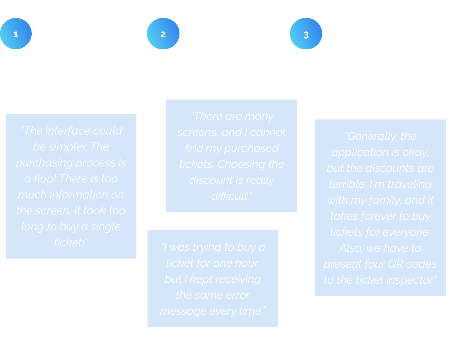
In some cases, users are forced to choose between as many as 25 different discounts. It has to be selected every time the user wants to buy a ticket. Every day, the same process. When the family is also part of the trip, the process becomes even more difficult. That made us think about how to make it easier.
Polish law has dozens of discounts, and we cannot reduce them. However, we can tell users to select only once and then reuse the declared discounts every time.
Moreover, as our research shows, 65% of our users prefer the "normal" ticket type (without any discount). It is the reason why we decided to set it as the default in every case when the discount profile is empty.
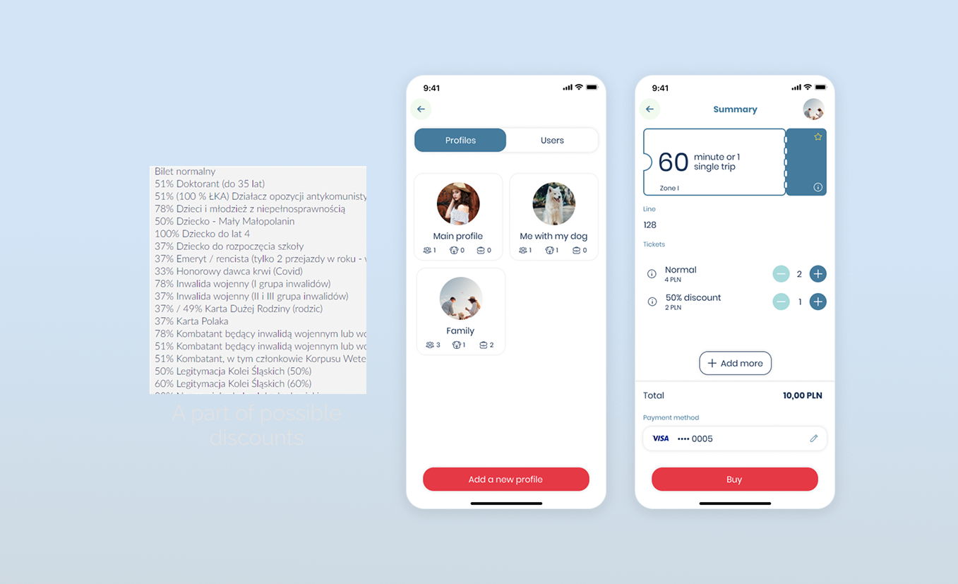
The main problems with the ticket-buying process were complexity, time, and a lack of understanding of the offers. Unfortunately, we do not have control over the offers and discount content. However, we were able to make it more readable by using our own short names and putting all the long ones in the description.
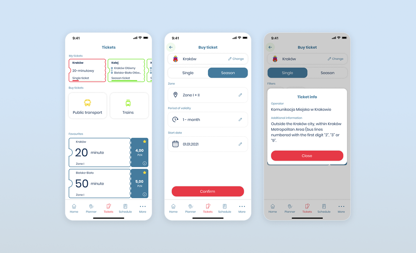
Following the necessary steps that must be taken when buying a ticket, we could skip a few or combine them. In fact, that makes the process at least 25% quicker (depending on the offer, provider, and ticket type).
The final change was to merge all the tPurses (internal prepaid payment method) into one and add more payment methods like Apple Pay, Google Pay and Blik.
Summary
To finish the first phase of the implementation of a new Ticketly release, we decided to run the usability testing with the selected test group, which was already involved in the interview session. Users positively reacted to most of the changes. After the testing, we decided to improve some of the application parts.
After implementing the first version, we were able to measure the success of the project by the following factors: